Tag Archives: feature fabric

‘Floating Duo’

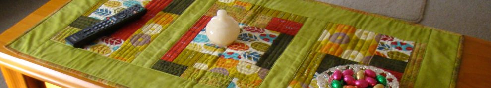
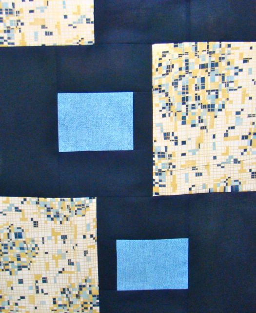
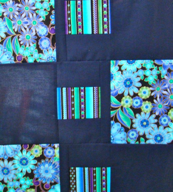
Another very easy to construct table runner is finished! The rich fabric pattern is set simply against a navy background, but what gives it a bit of a zing is the bright green binding. Quilting was a breeze, two lines in the background from end to end making a shape around the small patches. What I learnt with this project, was about quilt labels. In the Victorian Quilters handbook, there is a suggestion as to where to put labels on the back of a quilt. Apparently they go on the bottom left hand corner as you stand and face the back of the quilt. So from now on, that’s where the labels will go!
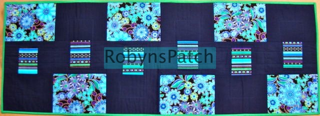
'Floating Duo'

‘Floating Duo’

Where do you put your quilt labels?


Would you make these colour choices?

‘Does this go with that?”, ‘What do you reckon?’, are just some of the ways patchwork quilters make decisions about colour choices for projects. Consulting colleagues in a class frequently brings out alternative ideas that surprise and delight. Sometimes a quiet hush can be interpreted as ‘Whatever were you thinking’ and you just know to ditch that option.

For the quick and easy table runner pattern ‘Paola’s Runner’, the colour choice technique used by each patchworker was to pull colours out of a feature fabric to decide the contrast and background.

Can you ‘see’ the thinking behind each choice that these ladies made?

Betty.

Betty.

Heather.

Heather.

Leanne.

Leanne.

Maria.

Maria.

Maria just loves the Clarice Cliff fabrics!

Pam.

Pam.

Dianne.

Dianne.

Dianne was so pleased to feature this print. It’s been in her stash just waiting for it’s opportunity to be showcased.

Sue.

Sue.

Robyn.

Robyn.

Sue and I chose the same background fabric and yet when set against different feature fabrics, the effect is different.

Do you agree with the choices of colour? Do any of these appeal to you?